The Best Fitness App Design: Examples and Typical Mistakes
User expectations of app performance have increased over time. Nowadays, users rarely tolerate programs that don’t satisfy them. In fact, one in five users will abandon an app after the first use. Poor design is among the most common reasons behind this.
It’s clear that mobile app design matters and is often the pivot point between an app’s success or failure. How do you make sure your app doesn’t suffer from avoidable design errors? Let’s analyse some of the best fitness app designs and some common mistakes to reveal how to make a powerful program and avoid the pitfalls of mobile app design.
Fitness App UI Design
A complex application can involve several dozen screens. Some of these screens are common− think sign-in or checkout screens− while others serve specific purposes. There are many fitness app design templates available. You can use these to analyse current models and draw inspiration before deciding on your own idea.
Here are some of the key design elements you’ll need to consider:
Home Screen
A fitness app home screen should show the user’s recent activity and their progress toward a specific goal, be it cutting a certain number of calories, completing a training course, and so on. Home pages should be kept simple, summarise the user’s experience with the service, and motivate users to discover the app’s features.
Most fitness apps provide training and nutrition plans so their home screens contain simple charts detailing progress. When app developers decide to implement changes, especially to a program with millions of registered users, they should mind the home screen before anything else− even the slightest corrections can ruin the experience.
For instance, when MyFitnessPal updated the app in 2018 and blog posts were highlighted on the main screen instead of diary summaries, users got confused. This case study shows a possible redesign and details how MyFitnessPal can return to displaying calorie intake and nutrients on the home screen.
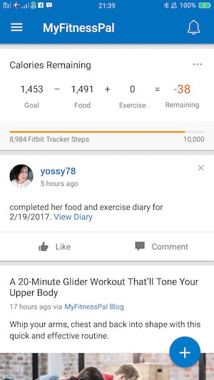
Current home screen in MyFitnessPal. Source: community.myfitnesspal.com
This is a feature of critical importance. When something disturbs users the moment they open an app or when the information they are looking for is hidden on a secondary screen, it is a losing battle for companies.
Home screen functionality heavily depends on an app’s purpose. The more functions an app has, the harder it is to present those on a home screen. Let’s take the period-tracking app Clue as an example. Clue gathers lots of information relevant to reproductive health but the home page simply shows a cycle with day indicators. As a result, the app looks clear, easy-to-use, and practical. Different parts of the cycle are marked by colour and a big button at the centre urges users to add their current data.
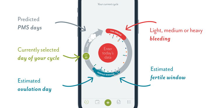
Home screen in Clue. Source: helloclue.com
Onboarding Screens
Practically every fitness app requires registration. The two commonest options for this are via email or Facebook. After an account is created, a given program usually asks users to go through a setup process and specify personal parameters and preferences.
While it may seem like a painless process, apps actually lose potential customers during setup.There are ways to combat this. If the app’s functionality is presented as static information, users don’t feel as motivated as they do when dynamically guided through each step. If it’s too hard to sign in, that’s another reason users abandon an app.
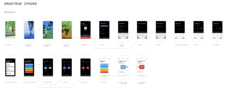
An important issue is making it possible for users to skip onboarding and explore the app without inputting a lot of personal details. Here’s how we handle onboarding in our running app SmartRun:
A nice move from the dietary app Lifesum− it asks users to set a goal, choosing from three options: stay healthy, lose weight, or gain weight. It gives users the feeling that the app will support them in achieving their goals. What’s more, the design adds some levity in even the smallest elements. For example, when a user fills in the introductory form specifying age, height, and weight, cute emojis appear on each line. Users also see a fun animation while waiting for the next screen to load.
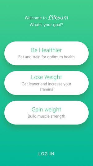
Goals in Lifesum. Source: steadyhealth.com
Freeletics uses the same tactics, asking a user to identify their top three goals at the very beginning. Unlike Lifesum, Freeletics doesn’t feature graphic images or animations designed specifically for an app. Instead, it has photos of athletes who perform the exercises in pre-recorded videos.
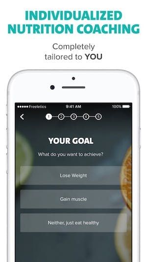
Goals in Freeletics Nutrition. Source: sensortower.com
Activity Tracking Screen
Fitness applications which track user activity should have a separate screen dedicated to that. At MadAppGang we developed an app for runners called SmartRun, to keep key info at the fore, the home screen was designed to track a user’s running session. Since we focused our application on heart rate data, it was essential to include a chart with the user’s current pulse and its changes during training.
We redesigned this home screen several times. In the first version, the chart occupied too much space and it wasn’t clear which colours indicated which heart rate zones and why. We rearranged the colours and added more information about the running session including average pace and distance. Then, we simplified it, leaving only the heart rate monitor on the main screen. But we needed to provide more than that so we redesigned the screen all over again. With the new version, we pursued a goal to make an app both informative and engaging. To this end, we added running details with recommendations on when to slow down or speed up, and implemented some animations.
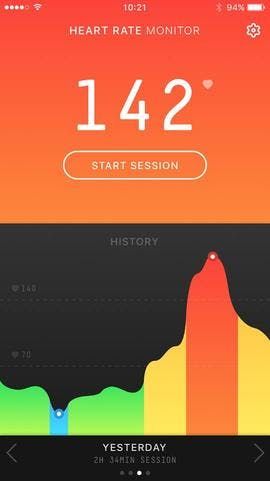
The first version of SmartRun’s home screen.
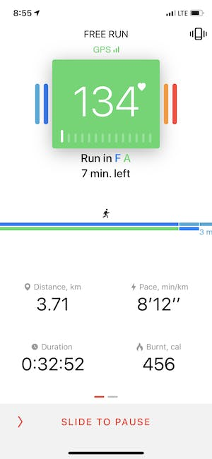
The final version of SmartRun’s home screen.
Apple’s Activity app has a very practical design. Three activity rings, which refer to the three main goals, are the main focus on the screen. At the bottom of the page, users can view their activity details, at the top of it, users are shown the week or the month’s general statistics.
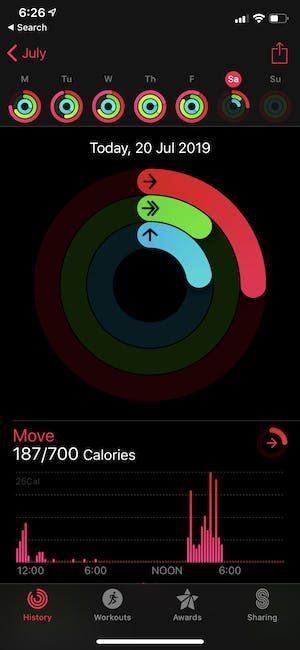
Activity Screen
Fitness Plans Screen
Whether it’s a diet, workout, or meditation app, there should be a screen with a number of plans to choose from and follow. There could be various types of workouts, each featuring a short intro and videos. When this comes as a basic feature, apps usually offer premium plans, which are more personalised. Let’s say a user has a workout generator based on their fitness level, desired duration, available equipment, and so on.
For instance, Freeletics offers numerous exercises for free and a coach service tailored to a particular user in a paid subscription. Since the coach feature is what makes money for Freeletics, the app offers personalised plans right on its home screen. It’s totally understandable but may be disturbing for those who don’t want to purchase a subscription.
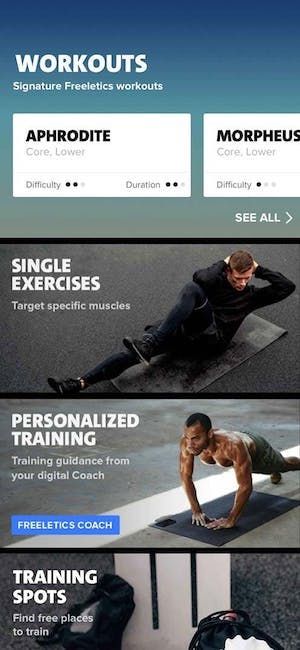
Fitness plans in Freeletics. Source: apps.apple.com
Our SmartRun app also provides running plans. Here’s the screen:

Colours
First of all, the colour scheme should be consistent. You should choose one primary colour, which is displayed the most and several others to accompany it. Properly selected colours not only facilitate user experience but boost brand recognition. Also, app designers have to consider colour-blind customers who struggle to differentiate between some colours.
Animations
Animations are of great help when making the app comprehensible for users. With animated elements and charts, people are more engaged and tend to use the app more often. In SmartRun, we implemented many animations. One is a simple pulse animation on the activity screen. Here’s another which shows the user’s performance levels over time:

Visual Design
Fun graphics and real-life photos are two of the primary imagery choices for health and fitness apps. It’s hard to tell which is better and the dividing line probably comes down to the fact that each element suits different audiences. If the application provides training, then it will probably use athletes’ photos on the background. In this Behance list, every single fitness app design shows a human body on its screens.
We can see different approaches to visual design in the two most popular meditation apps, Headspace and Calm, which we’ve covered previously in our article on leading fitness app developers. While Calm features beautiful landscapes, Headspace creates empathic animated characters to emphasise their message. You can use their cases as a source of inspiration for fitness app design.
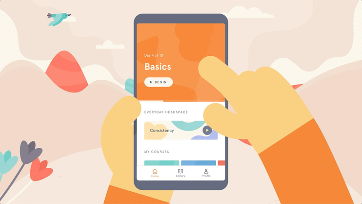
Visual design of Headspace. Source:headspace.com
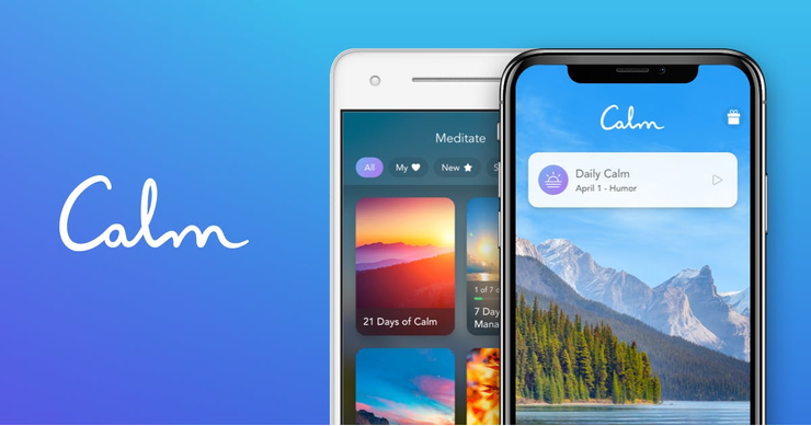
Visual design of Calm. Source:www.calm.com
UX Design
While an app’s interface should attract users, UX design is what makes for high user retention and popularity. When a program requires too many actions from a user, such as when there are too many buttons or their size is not appropriate for finger touch, it can ruin the experience.
One of the major rules here is simplicity: a user should be occupied by one feature at a time. When there are multiple functions, they should be viewed via several, easily swipeable screens.
It’s also important to consider a variety of mobile devices. If an app is released on both Android and iOS platforms, the versions shouldn’t look and feel much different. This is a real challenge for designers, as different devices require size optimisation. Another aspect to take care of is poor internet response− you might want your application to load information offline or with a slow connection.

Navigation
Users should be able to access the features they’re looking for without any friction. Cluttered screens and unnoticeable buttons are a sure dead end for an app. If there are more than three buttons on a tab bar, for example, it’s too complicated for navigation. If there’s no progressive disclosure and users have to endlessly scroll instead of opening only those icons they are interested in, users will swiftly look for better alternatives.
When a user fills out forms, it’s best to provide input masks and a smart auto-complete function. For fields which ask for numeric information, the keyboard should be automatically customised to a number pad.
Many design mistakes, as well as proven successful decisions, can be seen in checkout procedures. Normally, a person inputs several information fields, and if everything is presented on just one screen, it’s difficult to complete the form painlessly. The task here is to divide an operation into comprehensible parts and dynamically validate field inputs.
Another thing to consider is how the turn-back option is handled; it’s impractical if a user is sent to the home screen every time they click ‘back’. There also could be unpredictable awkwardness related to word usage. For instance, imagine confirming a cancellation. The potential to utilise confusing terms, ie. ‘cancel’ and ‘confirm’, where ‘cancel’ means cancelling not the action but the cancellation itself, needs consideration.
Notifications
Push notifications must motivate people to keep doing whatever they are doing to achieve their fitness goals. It’s tricky to find a perfect balance here. You want to provide just enough push notifications. Too many, and users will abandon the app, in fact, this is one of the top reasons users drop a program. On the other hand, too little or no notifications may mean that users forget the app even exists.
The nature of fitness apps lends itself to notifications which are positive and motivational. People want to make progress and cheerful messages won’t hurt. Sometimes, applications strive so hard to create a motivational community that they send notifications about friends’ activities. Comparing results is a great, competitive feature for many fitness tracking apps but it doesn’t necessarily mean that notifications about somebody else’s progress are interesting for users. There were complaints about such features in Strava, for example.
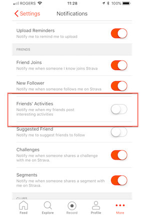
Notifications in Strava. Source: support.strava.com
Privacy Issues
When an app asks for permissions, it should be clear to a user why that is needed and what information is shared. The intervention of privacy is a big concern among fitness app users, any app has to assure users it’s not tracking their user data without permission.
Introducing Changes in Fitness App Design
It may be best to redesign an app at some point. But redesigns should be based on user reviews and change only the features people had a negative experience with. However, it can bring trouble− the MyFitnessPal case we mentioned earlier is a testament to that fact. No matter how great a fitness app idea is, the product won’t gain support if it doesn’t display what users expect it to.
Some examples from social media apps show how painful it can be for users to adapt even to the smallest change such as an icon switch on Twitter. Millions use fitness tracking applications as a part of their daily routine, which is why changes should be implemented only as a result of communication with customers.
In-App Purchases and Subscriptions
If you want to include a paid fitness service in your app, think about how you will promote it in the free version. Users should clearly understand the benefits of premium subscriptions and be intrigued by the offering. For instance, Lifesum shows food ratings for every meal but insights related to the scientific meaning of these ratings is accessible by premium users only. To get people interested, the app asks them whether they want to know more about nutritional values, engaging them to learn.
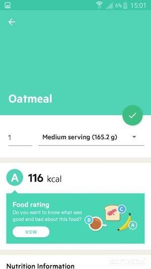
Lifesum encourages users to learn about food. Source: mobile.softpedia.com
You don’t want to irritate users by randomly notifying them about the paid version. Instead, an item you want to sell or a paid subscription plan offer should correspond to the user’s actions. An app can send encouraging notifications when a person finishes a basic training plan, for example. Every detail matters in how purchases are presented. Even the colour of a ‘buy now’ button can create a sense of urgency.
Consistency
To make your fitness app powerful, you need to create a functional and distinguishable design. Test it on end-users during each iteration to make sure every feature is displayed in a convenient way. The style of your application should be consistent across all the visual elements, like buttons and types, as well as the interactive elements, like animations. Learn from the best fitness app templates but make your design unique.
To start an application, you must define your target audience and which pain points your service is going to solve. You can build a persona and an empathy map or a user flowchart, or adopt other techniques which allow you to learn who the end-user is. Only after researching the market, learning from the best fitness app designs, and interviewing people, can you fully understand which features an app needs, how to prioritise them, and how to present them on multiple app screens.
Have an idea for a unique fitness app? Reach out to us and we’d be happy to discuss both its design and development with you.
15 August 2019
