Case study: SmartRun
How We Built SmartRun, the Only Right App for Running. Powered by AI and Backed by Science.
iOS
BTLE sensors
Health Kit
Watch OS
Kalman Filter
Doing sports is popular today
Do you run? Swim? Go to the gym every other day? Participating in sports and getting fit and healthy has become a positive habit for many people. There are countless possibilities today to find the most suitable sporting option and with amazing apps available on the app stores, doing sports gets even more enjoyable!
Looking for some fun and motivation to reach your health goals? There is an app for that! If you love swimming, SwimIO is one of the best options to track styles, laps, and time spent in the water. If you love golf, the GolfShot app is your perfect game companion. If you like running, with Strava or Nike+ Running you can track your performance and achieve new goals.

At MadAppGang we have a special love for running.
With the above running apps and a number of amazing devices such as Apple Watch, Fitbit, Garmin, and Suunto it seems we've got everything we can dream of to make our runs perfect.
But there is one problem.
Most running apps are focused on your performance, not your overall health. Running is often referenced as a cardio activity. But in the majority of the available running services the focus of the App is for the runners to track distance and time, not the heart rate (HR).
Most of the existing running apps serve as monitors that display your running parameters. The training plans that some of them provide aren't personalized. And performance monitoring is only useful when you know what you need to strive for.
If you want to be healthy, tracking performance isn't the best training strategy.
The science of running
According to recent medical research, heart rate is a very precise way to measure how your body reacts to your current physical activity in real time. This metric is very personal. Unlike body temperature, heart rate is very specific to each person and their current body condition.
Your body can be mapped to the following five zones:
- Relax zone. This is when you watch TV or sit in front of a computer.
- Fat burn zone. This is when you're walking.
- Aerobic zone. This is when you're running and heavy breathing begins.
- Endurance zone. This is when you're running and deep breaths, taking is avoided.
- Extreme zone or Anaerobiс zone. This is your gym workout mode or sprint running.
To create a healthy heart and cardiovascular system you need to exercise for at least 30 minutes in the second (fat burn zone) and 30 minutes in the third zone (aerobic zone). To burn fat you need to exercise at least 40 minutes in the (fat burn zone), three or four times a week. To build endurance you need to exercise in the Endurance zone at least for 40 minutes a week.
As you can see, there are only two parameters involved here: time and heart rate. Distance and speed aren't as important in the training process if you want to lose some fat or do some cardio exercises.
SmartRun was born
We decided to build SmartRun – an app for heart rate training – because we couldn't find a solution that would allow people to intelligently measure time and heart rate to keep their hearts healthy.
SmartRun uses cutting-edge technologies to help runners train effectively and achieve their health goals. A healthy heart is your engine to a healthy you! To build this app we needed to meet the following requirements:
- Let’s make the app simple and engaging. It should focus on the time and heart zones to improve training productivity.
- Integrate a heart rate sensor to monitor user heart rate in real time.
- Use GPS and accelerometer to track running progress and prevent injuries.
- Apply artificial intelligence algorithms to create personalized training plans for each training session based on user data.
- Add social features so users can get support from their friends and family.
We needed to solve the following seven challenges to develop an awesome product for our users.
Challenge 1. How do we design the main screen?
Making the app simple and engaging

This screen needed to show:
- Current heart rate
- The time a user should spend in the needed heart zone
- Performance chart that shows how heart rate changes with time
- Sensor settings
- Session management with Start, Stop, and Pause buttons.
The design had to be as simple as possible so a user could understand their body condition at a glance. Here is a story of how we approached this design challenge:
Designing the main screen. Version 1

The first version was basically a good redesign of our initial wireframe. Each heart rate zone had its own color. The background color of the top half of the screen was changing in response to the heart rate changes. The chart is divided into sections in accordance with five HR zones. And each section reflects the color of the zone. The background of the chart could be light or dark, depending on the time of the day. The bottom part had scroll options to review the previous sessions. The top right icon is dedicated to settings where a user can connect and tune their heart rate monitor.
Everything was clean and simple in this design. And this version was a perfect one to start with.
We found 40 beta users and released the app using TestFlight, an online service for installation and testing of mobile applications.
After a couple of weeks, we revealed some major issues.
What was wrong?
- The chart occupied half of the screen and stole all user attention. But during a running session, the chart is not important at all.
- The screen had too many contrast colors. Too much contrast creates so much vibration that it diminishes readability.
- A user had no knowledge of the zone color codes. Also, the color codes didn't provide any prompts to the user as to when they need to speed up or slow down.
Optimizing the colors
We started working on the colors to make sure colorblind people could read the data on the screen. Luckily, we had three colorblind people on our test team so we could detect the problem right away.

Improving the layout
After that, we started looking for the best way to show the heart rate zones, the active zone, and the current position in the active zone.
Here is a variation of the vertical layout:

And here is the evolution of the horizontal layout with the final version on the right:

In the last version, you can see a narrow line between the first half of the screen with the current heart rate and the second half with heart rate zones. This line has all zones arranged in order – from Relax (blue) to Maximum Performance (red). Users can quickly see their current zone and track the position of their heart rate inside the zone.
Adding more information about the running session
Next, we realized that we needed to add some more information about the running session on the main screen. When the session is active, a user can see the duration, distance, and target zone guidance.

In the last version, you can see a narrow line between the first half of the screen with the current heart rate and the second half with heart rate zones. This line has all zones arranged in order – from Relax (blue) to Maximum Performance (red). Users can quickly see their current zone and track the position of their heart rate inside the zone.
Making the screen look simple
In the following iteration, we created a simplified main screen option:

Everything is clean and simple here. After a couple of sessions, users became familiar with color codes and could identify their current zone in a fraction of a second.
We kept this version for long nine months. During this time we collected a huge amount of data so we could start working on intelligent algorithms for running plans (more on that a bit later).
But because this simple version served only as a monitor, it didn't differ from any other existing running apps.
We needed more than that.
Start over!
Despite the fact that we had spent hundreds of hours improving that version, we had to admit that if we wanted to create a really innovative product we needed to do better!
As big fans of Agile we started with a minimal implementation, ran real trials and collected user feedback. Then, we iterated based on this realy human feedback and improved the project to build things that really mattered to real users
The navigation adrenaline zone!
Nobody knows the final destination and when you're going to get there. That’s why it’s impossible to plan the release date, budget, or team size. This doesn't sound very business friendly. But it’s the only way to create a product that works. The only rule here is to move. After every iteration and trial, the next planning process should start with a new knowledge.
Thanks to the Agile approach and continuous customer testing we came to the point where we knew exactly what we needed to develop.
Designing the main screen. Version 2
Before we dive any further, let's first summarize what was wrong with our first version:
- It was functional but not super engaging
- Crowded realestate! The screen already had lots of information and there was no way to extend it.
- The design style quickly became boring to users.
- The design elements on the screen weren't informative enough.
- We needed to integrate an artificial intelligence trainer with training guidelines. Our app is more than just a monitor.
The first proof-of-concept of the second version of the screen came to life after dozens on long nights and under a mountain of juice bottles & healthy vegan pizza boxes!
This version was a huge improvement!
But we still wanted to do better! Too fussy?
After sleeping on it for a while, we found that the circle zone indicator didn't work super well for us. We needed a solution to
- Show the current zone
- Instruct the user to speed up or slow down the zone as required.Make the screen more readable
- Be highly engaging and look cool!
Working on the heart rate indicator
Almost all running apps use arches, circles or lines as indicators of heart rate zones. These elements show very little information and occupy a lot of screen space.
We needed something new. Our solution should be clean and easy to read. It should show all heart rate zones and the current HR within a given zone. But the most important element is a heart rate value.
We came up with a completely new animated UI element. We called it “battery indicator.” Hmm, a battery is a nice association with energy that running gives to you, isn't it?!

This one simple design element – a battery – shows everything we wanted to say in the previous version. And it doesn't take up all the space. It occupies only ⅓ of the screen. Here is the information that the battery displays:
- Each section on a battery is a heart rate zone
- Users can see their current HR and its position within the zone
- There is a simple guide to slow down or speed up
- There is a pulse indicator with heartbeats
Animations are a very powerful tool for engaging users. They add one more depth and dimension to the design. Just look at how we implemented some use cases using proper animations:
Challenge 2. How do we integrate a heart rate sensor?

Let’s get technical! ANT+ or Bluetooth?
There are two ways to transmit the data from sensors to a smartphone: ANT+ and Bluetooth (BLE).
Bluetooth is the most common solution. Unfortunately, it has significant limitations. BLE sensor can be connected only to a single receiver. And Bluetooth devices have a pretty complicated pairing process. You can experience this process when your BLE headphones or a keyboard disconnect accidentally and don't want to connect again.
ANT+ doesn't have these limitations. It’s very stable. It doesn't require the pairing process. And it can be used by a number of readers simultaneously. Moreover, ANT+ devices are more power efficient. Garmin, for example, uses ANT+ devices.
Unfortunately, iOS does not support ANT+. It only supports Bluetooth. That’s why you can't connect your Garmin sensors to your iPhone. But you can connect it to some Android devices, such as recent versions of Samsung Galaxy and Note phones.
We would be happy to support both, BLE and ANT+ devices. And hopefully, we will. When Apple adds support to ANT+. But now we are limited to Bluetooth sensors only.
So our goal was to make the process of pairing Bluetooth devices with a smartphone as easy as possible.
Connecting a Bluetooth sensor
There is a number of options to connect Bluetooth sensors to iOS:
- By using the Apple Health App and HealthKit API to read sensor data
- By connecting directly to the Bluetooth protocol to read heartbeats
The first option looked great! Moreover, it's the Apple's recommended way! The idea is simple - you can connect your heart rate monitor with the Health app.
The Health app writes the data directly to HealthKit. Every app can read this data (if the user allowed it). HealthKit works like a broker: it gets the heart beats from the sensor and gives them to everyone so many apps can read the sensor data simultaneously. With a direct Bluetooth connection, this is impossible because only one app can get access to a Bluetooth device at a time.
Unfortunately, after implementing the integration with the HealthKit API we ran into several big issues.
Three problems with the HealthKit API
1. User experience
The first issue is complexity and fatigue in the user experience. A user has to go to the Bluetooth settings and pair their heart rate sensor with their phone. After that, they need to go to the Health app and connect this sensor as a data source. After that, the user must allow the app to use their personal data. And if anything goes wrong with the sensors, settings or permissions, the app won't be able to detect these issues.
2. User permissions
Just imagine, you're building an app that requires you to have access to the users' HealthKit data. You want to be able to read certain bits of information and the app's functionality is kind of crippled without that data. There must be a way to know if the user allowed you to access their health data, right?
Actually it turns out you are not allowed to know that and quite rightly so, Apple deems even the information as to whether a user accepted or denied the read permission for HealthKit as sensitive information.
When you ask a user for permissions, HealthKit never returns whether the request has been accepted. They just tell you if the request has been completed.
3. Locked screen
The other big problem is a locked screen. We haven't predicted this either! When you lock your iPhone, all your sensitive information is closed to all third-party software unless you unlock the device. As a result, when a user locks the screen, the heart beats stop coming to the app and all the guiding and real-time performance monitoring stop working. This limitation completely blocked us. It would be crazy to push users to keep their screens on while running!
So we decided to go another way and it worked perfectly.
Connecting to Bluetooth devices directly
We could discover nearby Bluetooth devices and automatically connect to them to read the data! We are also able to remember a previously connected device and reconnect automatically next time we went for a run. When the device battery goes flat or the sensor contact is weak we can guide the user through the process of fixing the issue.
And the most significant advantage is the app is now able to read sensor data in the background, even with a locked screen. So the user can save battery life and follow voice instructions whilst keeping the phone in the pocket with the screen off.
Here is what paring with a Bluetooth device looks like:

There are only two taps required to connect the device: 1) open the list of devices, and 2) select the device in the list.
All statuses, troubleshooting, and recovery instructions are in place. A user doesn’t have to leave their current context to connect, reconnect or discover their sensor. Happy days!
Challenge 3. How do we track the running progress?
As you already know, the two main metrics that our app measures are time and heart rate. But are these two metrics all we need? Of course not!
Our users are not just scientists hanging out in laboratories, they’re probably going to use the app while running outdoors and in the gym. For the outdoor mode, it’s nice to have GPS tracking. Using GPS we can track routes, elevation, and speed. Why is it important for the app?
Tracking running performance is part of user motivation. Analyzing and seeing a running route is just so much joy :-) A user can compare their performance over time and seel the progress: regular running in the same heart rate zone at the same time will lead to running faster and for a longer distance. Progress is vital for building self efficacy and long term motivation!
Last – but most critical – the app needs to understand user context and geography. For example, running downhill is not the same as running uphill. Thea artificial intelligence engine should integrate contextual metrics while calculating the performance score and planning future training sessions.
Challenge 4. How do we prevent injuries?
Integrating an accelerometer
The SmartRun's primary role is to help beginners avoid injuries. And almost all beginners make the same mistake – they make long steps while running. It’s very harmful to muscles and joints.
A large step is like a jump. And a jump is a collision with the surface that causes shock. To avoid this harmful effect, a runner should run with short quick and lighter steps to prevent the collision shock.
That's why our app needed to help users monitor their step rate. We used an accelerometer to calculate it. Done!
The Apple HealthKit has an amazing built-in step counter. But as you remember, the HealthKit data can't be accessed with a locked screen, so we couldn't guide our users about their step rate.
But since user health is our primary priority, we built our own neural network that counts steps in real-time. Nice one us, it works like a charm!

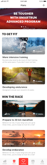
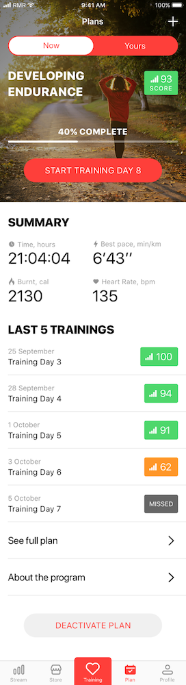
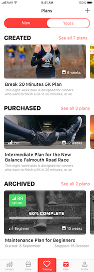
Challenge 5. How do we create personalized training programs?
Using artificial intelligence to build your own running plans
The key priority of the SmartRun project is to guide the user step-by-step through the customised process and rhythm of healthy running.
Usually, the decision to start running is an impulse decision. There is danger of dulling that momentum if we start the process with a ton of healthcare information!
As mentioned earlier, the majority of running services are just monitors: they measure and display the results. There are a number of amazing services that guide the user through the training process with various training options a user can choose from, e.g.train for a marathon, lose weight, recover.
But wee believe these options aren't enough.
For sustainable and ongoing health understanding the why and how of fitness is essential. Very few people will just follow the instructions without understanding why they need it. Such guides can appear giicky and are simply not working as a long-term strategy.
Biofeedback and Education!
We’ve simplified biofeedback and made education a part of our training plans! Within each exercise, a user is learning new knowledge about how training affects his or her body and how they can help their bodies adapt to the training process.
This sounds reasonable, so why are we so special?.
The critical consideration is that everybody is unique. Body condition, lifestyle, age, gender, food, etc. – we all differ. And instructions for one person can be useful for some people and harmful for others.
The only way to get the right instructions tailored for you is to ask those guys who know you pretty well - your body and heart!
We implemented a training strategy that constantly adjusts the training plans with the help of AI. Our AI powered biofeedback smart engine offers adjustments based on the data from the previous training. Continuous learning, continuous adjustment and continuous improvement!
Here is how it works: a user starts with general low-intensity sessions. The AI is watching how their heart reacts to this training and intensifies it when the body is ready.
As you remember, user health is our primary priority. To train the AI, we are constantly gathering anonymous training data. The AI powered biofeedback smart engine is getting smarter every day.
Challenge 6. How do we increase running motivation?
Sharing runs with friends and family
Building self efficacy and thus ongoing motivation in running is vital. Turning exercise into a habit and part of your ‘everyday’ routine will improve your health and wellbeing as a result.
A running partner or ‘accountability partner’ is a fun and proven way to keep you motivated. You can support each other through motivation peaks and troughs, and it’s always nice to have someone who feels the same and understands you through personal experience.
Your friends and family can support you as well with their comments and likes on Facebook. But you probably already have friends who flood your Facebook feed with messages about running. Often those posts can become annoying after a while because the majority of their messages such as “I have finished my 5k run” are plain boring. Furthermore are we really convinced they actually completed that 5k’s themselves or was it with the assistance of an electric scooter?? Who knows right!?
We believe that your training message needs to be authentic, personal, emotional and easy to create. We worked hard to introduce the sharing features in SmartRun and furthermore with every SmartRun post your viewers will see your heartrate right there, proof alone of your efforts, done and dusted!


As you can see, there is a variety of options to create a beautiful post. You can share your photo after training, or post a picture of beautiful views you took while training. Or you can post a map of your route with the information about your heart rate - clear evidence of a job well done You can post stickers, widgets, and add text to the post.
Every time you open this screen, the app will compose a new unique post for you... Just two taps and your unique message is sent to your support team and perhaps a little spice to incentivise the competitors amongst us!
Challenge 7. How do we integrate Apple Watch?
Adding Apple Watch as a heart rate sensor
Apple Watch has a heart rate sensor itself. It works very well for measuring heart rate during the day. Unfortunately, it is not very good for real-time measurements (which you need during running sessions). It can also lose contact with your skin when you move your hand. Sweat also affects the sensor's reading ability. The best way to avoid this is to use a running watch band.

We added the ability to use Apple Watch as a heart rate sensor.
Apple Watch is an amazing companion device. You can put your phone in the pocket and look at the information on your training session on your watch.
All running applications we know show you the heart rate that your Apple Watch measures. As we mentioned above, this is not the most accurate way to measure real-time HR. That’s why on the smartwatch, we are showing the HR from your sensor, not your watch. This feature is quite amazing, you can see the most accurate HR results in real time on your watch!
To work out how to best show all the information about a training session on a tiny watch screen we ran a series of draw-try-feedback loops: creating a design, implementing a prototype for Apple Watch and then testing it on a real device.
We achieved excellent results, all the critical information fits into two screens. Furthermore a user can swipe between them while running. Nice!

So what's next?
We've gone a long way. But the process is not over yet.
We're really proud of what we've done so far, we are happy to see a backlog of 300+ tasks on our Kanban board completed!
But here is what we're going to do next:
- Build a separate app for Apple Watch with training plans so users can go for a run without their smartphones
- Develop a SmartRun version for Android that integrates with Fitbit and Garmin smartwatches
- Add running challenges
- Implement an AI driven personal health advisor
We have already spent over 10,000 development hours to implement this current version of SmartRun. We are now ready to release the MVP. We have come a long way but we are only at the start of a big journey to create an absolutely delightful, intelligent and personalised health and fitness application. We would be really grateful to hear your feedback and ideas to help us achieve this goal!
We are open to partnering with other health tech projects and we'd be happy to talk to investors who are interested in joining us on this authentic health and fitness journey.
Get in touch for a video call to learn more or come and catch up for a run and a coffee!
Best in health, happiness and running smart!