Healthcare Mobile App Design: A Guide to the Industry’s Best Practices

Market Researcher
From the very first solutions till now, unintuitive design is a recognisable problem in healthcare software. Both institutions and patients are reluctant to adopt digital tools, largely because of their design inadequacies.
Experts claim that design has been regarded as unimportant in healthcare and that companies need education focusing on why design is worth the investment.
Truly helpful, easy to use, and engaging mobile apps are developed with proven design practices at the fore. This is even more important in healthcare applications, which are used not for fun but out of necessity. Healthcare apps should help the general public solve any pain points in their daily lives.
MadAppGang have developed health-related solutions and we’ve faced common design challenges. For example, we redesigned the main screen of our running app, SmartRun, several times to make sure it’s simple and engaging.
Design matters, no matter the industry and healthcare in no exception. With that in mind, here we go over the principles that are proven to work in healthcare mobile app design.
The Best Designed Healthcare Apps
Companies that develop medical apps have focused more on design in recent years. So while elegant interfaces and top-notch usability still aren’t the norm, there are successful examples we can learn from.
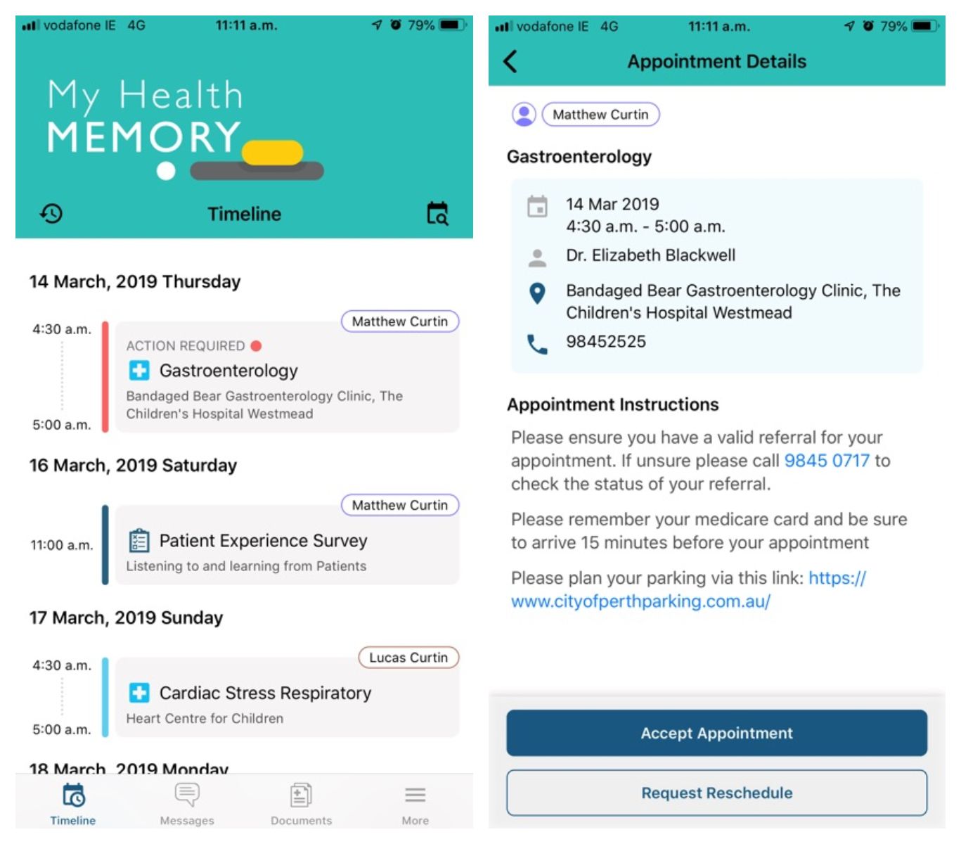
Australian app My Health Memory – made for managing care at a children’s hospital – won a prize at the 2018 Microsoft Health Innovation Awards. The hospital’s representative said a co-design principle was key.
Before starting development, the team conducted a series of discussions with patients and their families to learn what they needed and what mattered most. Active user involvement led to success. My Health Memory was designed to match all user expectations: its features are as simple as possible, it keeps users on track, and it won’t let them miss a scheduled dose.
Source: AppAdvice
We can see that other award-winning applications aim for simplicity and functionality. And they start by learning more about their users’ needs. For instance, the telemedicine app HeyDoc! is easy to use and doesn’t feature anything that could distract from patient-doctor communication.
The Mosaic app for LGBTI aged care makes it easier for both patients and organisations to improve quality of care thanks to its research-based functionality and intuitive navigation.
HeyDoc! Source: APKPure
Mosaic. Source: Good Design
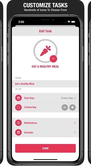
Minimisation and customisation are recognised as critical elements in Streaks, a 2016 Apple Design Award winning healthcare app. Essentially a habit-tracking to-do list, Streaks limits the number of tasks users can create and allows them to choose from a variety of icons and colour themes:
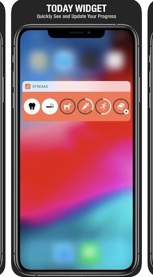
A clean-looking Streaks widget
The successful redesign of the Oscar Health app revealed many of the significant problems in healthcare tech and was actively discussed in the media.
When the team decided to redesign, they defined their goals, conducted reviews, and then developed three prototypes for user testing. They also maintained a focus on accessibility; readability was improved by adding larger font sizes and darker colours with higher contrast.
Finally, Oscar’s team pursued a goal: to help users discover features with as little friction as possible. By limiting the number of navigational buttons, users could find everything quickly.
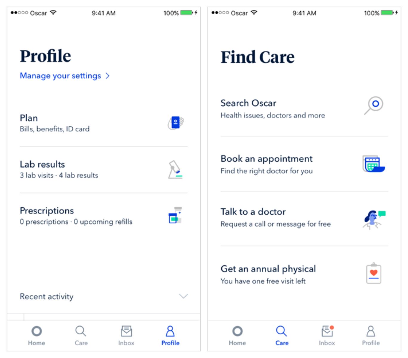
Source: Oscar Health
As we can see, those companies addressed several UI and UX challenges in healthcare app design through these key points:
- End user involvement: Users are rarely invited to test design schemes and different versions of a healthcare app. However, it’s important to incorporate user needs at every stage of the process. User interviews help identify the right design direction for the audience.
- Diversity of users: Accessibility is not optional in health apps. You need to be inclusive of sensory impairments.
- Room for future improvements: Since technology is improving and new standards emerge with the release of new smartphones, it’s important to keep up and make the app scalable enough that it can adjust to new screen sizes, shortcut rules, and so on. Sometimes, you might need to embrace the brand’s newer visual style, one that may have evolved since the initial launch.
- Navigation simplicity: Quality medical mobile app design features extremely easy and intuitive navigation. In a study of user perception of health apps, respondents named ease of use as critical, stating a desire to get to the process as simply as possible.
There’s more space for creativity in mental health applications, we described some inspiring examples in our post on fitness app design.
Before we dive into best design practices, note that on top of valuable functionality and ease of use, you should focus on security. All healthcare applications that use health data protected by national laws, no matter how the apps use data, have to be compliant with HIPAA or other regulators.
1. Provide a Seamless Onboarding Experience
The onboarding process is when a user gets familiar with what an app offers. If there’s no clear guidance on how to navigate through an app or something isn’t working, users will probably abandon the program.
In the first couple of screens you need to show the value of your app. It’s common practice to add two to four swipeable screens that explain how the service works and what the benefits are. The technique of providing instructions gradually is called progressive disclosure.
Let’s look closer at two popular appointment applications: Doctor On Demand and Zocdoc. They approach onboarding differently. The former offers several screens for users to learn what to expect and right after that asks them to register. The latter, on the other hand, doesn’t give general information and allows users to browse the app without registering.
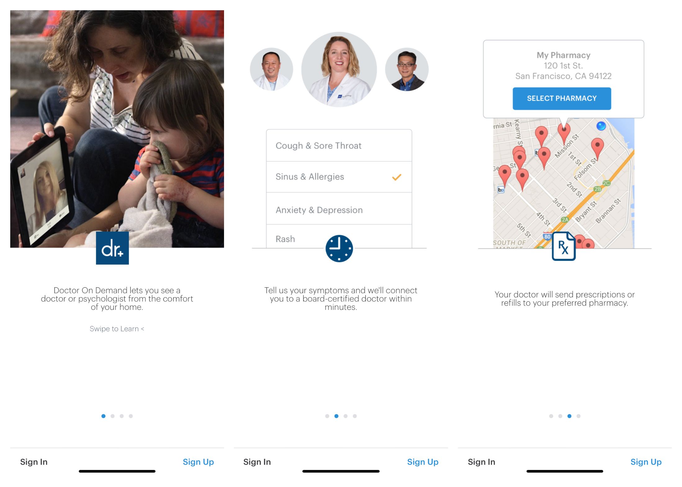
Doctor On Demand
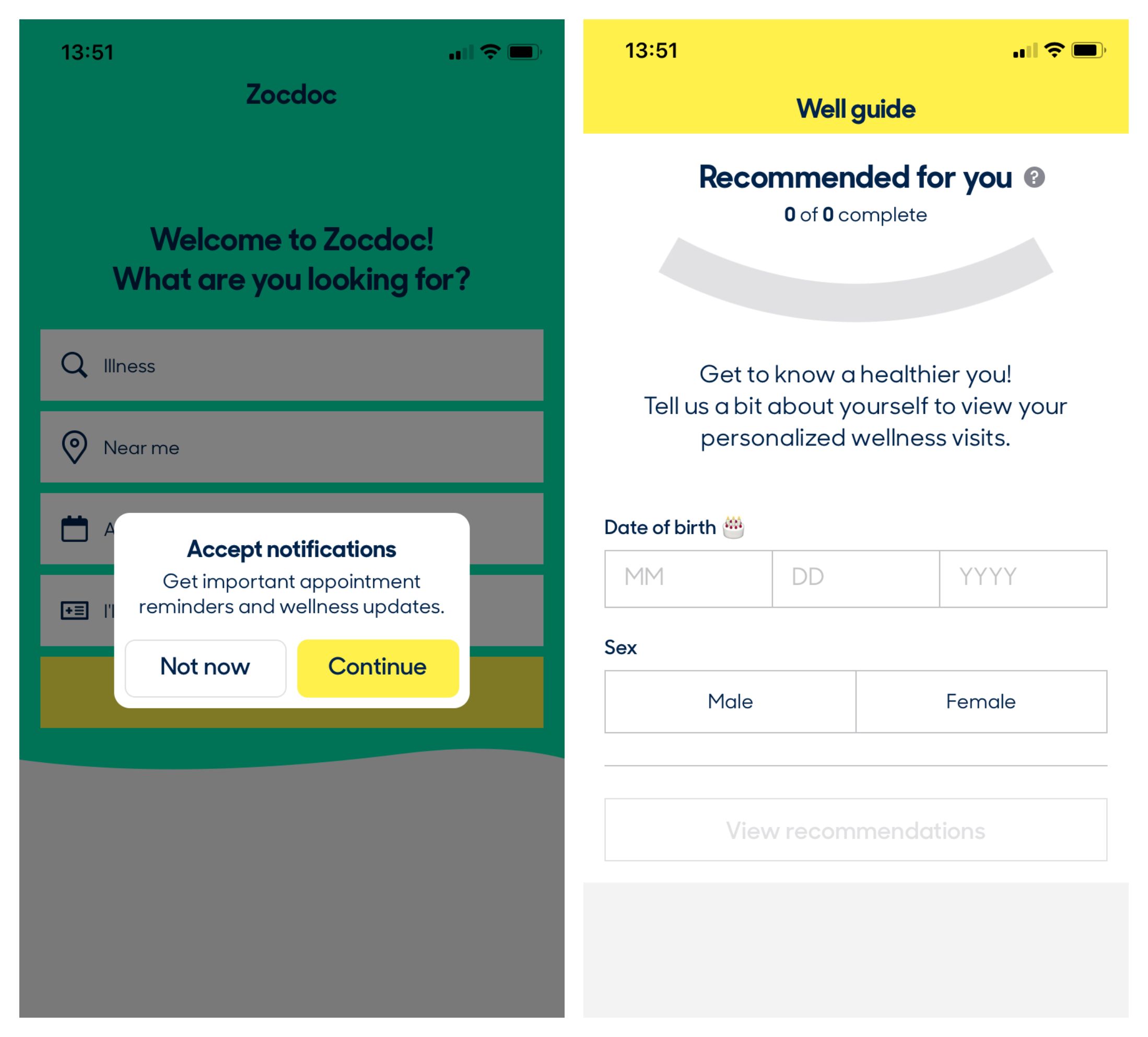
Zocdoc
Onboarding in the sleep tracker Pillow is a nice example of how to present essential healthcare app components. The first screen offers an informative video explaining how Pillow works. The next three screens familiarise users with important aspects of the app: privacy policy, storage options, and permissions.
Only after such an introduction does Pillow guide users through paid plans and offer instructions on how to start tracking sleep patterns. Pillow’s free trial period means users can decide risk-free if they like the service.
Progressive disclosure is not only helpful during onboarding. You have to break every action performed via the app into small chunks and demonstrate one function at a time.
Healthcare apps can also utilise empty state screens during onboarding. For example, pill reminders or period trackers usually ask to add data and then explore how it’s kept and processed. Here’s how Medisafe’s empty state screens look:
Once filled with data, the screen transforms into a log of entries.
2. Ensure Fast Loading Speeds
Slow load time is a major reason behind user frustration and app abandonment. Users expect an app to load in two seconds or less and will delete a program if it takes six seconds or more. If your application consumes lots of data, consult with experienced developers on how to make it work smoothly and quickly.
Apart from initial loading, consider other loading times. For example, when an app is analysing questionnaire answers or submitted health measurements to provide further instructions. In such cases, you can design attractive animations to show the loading progress and stop users getting bored.
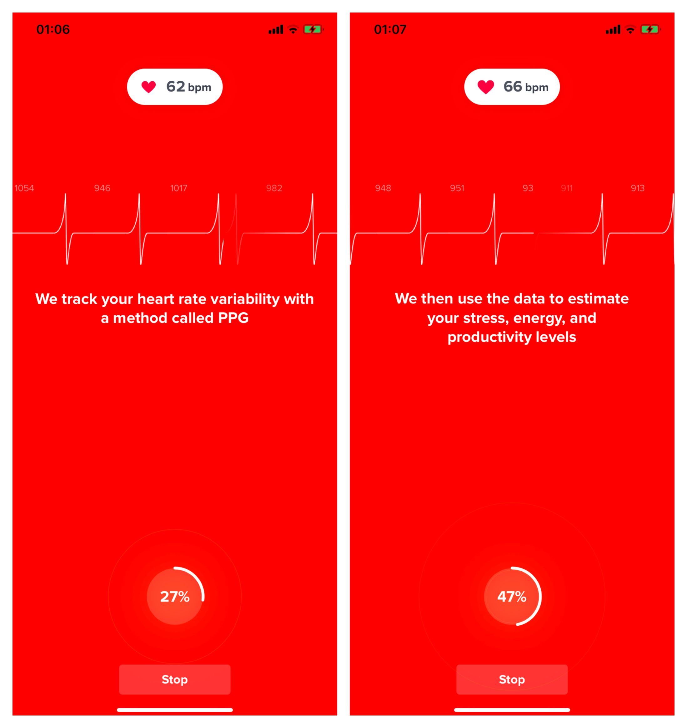
The heart rate monitor app Welltory features an animated cardiogram while a person is taking measurements. It also shows a loading bar and explanations on how the service functions:
3. Keep Navigation Simple
A mobile app can’t be widely adopted if it takes people too much time and effort to understand how to use it. A healthcare app design should be centred around a clean and intuitive UX.
Predictable interface elements are part of convenient navigation. Many applications have familiar elements such as a hamburger icon to reveal a menu or a plus icon for adding data. Adopt standard navigation components like the tab bar in iOS and the navigation drawer in Android.
The navigation drawer in the V3C app. Source: APKPure
The old Apple Health tab bar
Shortcuts are another helpful navigation tool. Define the major functions that shortcuts will represent and make these accessible without launching the app:
Welltory’s iPhone shortcuts
4. Consider How Users Hold Devices and Press Buttons
Your app should be easy to navigate for everyone: right- and left-handed users, those who hold a phone with one hand, and those who hold it with both. Then there are users who favour a horizontal mode and those who don’t. Define the users and make a scheme for each type. Then, put all interactive elements in a natural thumb activity zone.
Size of buttons, letters, and other elements also really matters in app design. Provide controls large enough for an adult fingertip to push easily. Android and Apple recommend making buttons no less than 48px and 44px respectively. Also, opt for a reasonable text size and don’t use decorative fonts – these can be misleading and unclear.
For example, the following text might be easy for all users to read:
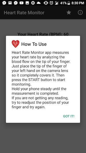
Heart Rate Monitor. Source: APKPure
On top of that, give users control over how the app’s content can be displayed based on their preferences. Include the option to change to horizontal mode, magnify text, and so on.
Horizontal mode in Pillow. Source: Neybox
5. Make Your App Accessible to a Wide Range of Users
No matter your target user group, your app needs to be inclusive of users with sensory impairments. Accessibility is not only a matter of ages and genders, but also concerns different levels of visual acuity, hearing, and attention span. For example, people with motion sickness can be disturbed by the excessive usage of animations.
Many mental health apps already support hand-free controls via technologies like Alexa or Google Assistant or their own voice recognition system:
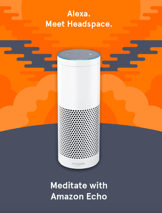
Alexa controls in the meditation app Headspace. Source: yoonfagan
Mobile platforms have in-built tool sets for accessibility. For example, iOS provides:
- Voice control: So users can access all features hands-free
- VoiceOver: To navigate the app without looking at the screen
- Siri shortcut: To automate routine processes and connect to other apps or devices
- Reading support: Allows users to listen to text instead of reading
- Dynamic type support: For users to adjust the text’s size settings
6. Boost Personalisation
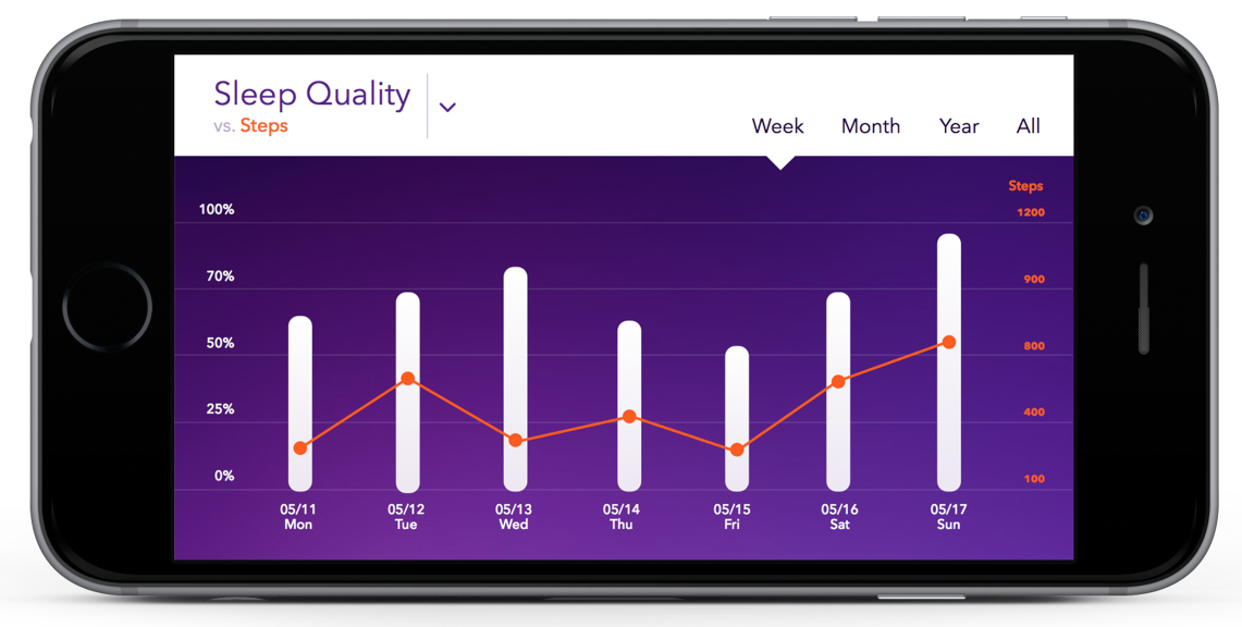
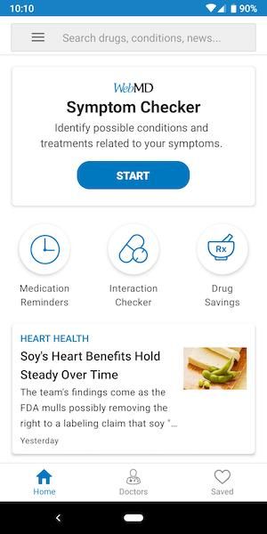
You need to embrace both universality and personalisation. WebMD’s redesign was centred around increasing personalisation: they added personal health tips, topic bubbles, and a news feed crafted to particular interests and medical information. There are many customisation options: colour themes, notifications, interactive elements and more.
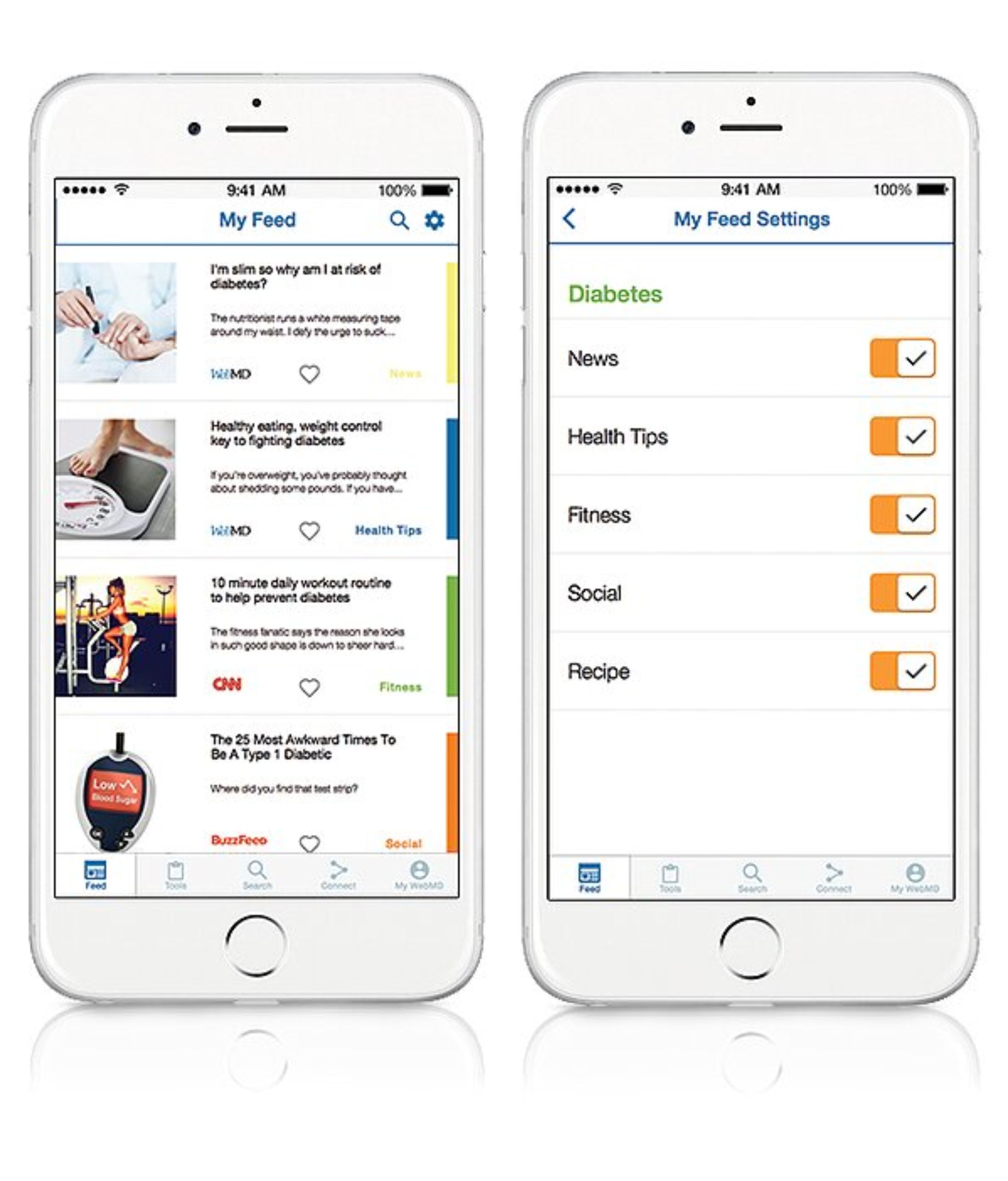
Personal feed and feed settings in WebMD. Source: micheline.design
7. Minimise Content on App Screens
A powerful design rule for healthcare apps is that less is more. Overloading users with information and various interactive elements won’t work. Instead, create a healthcare app UI with minimal components.
Minimisation is key in design but also in the app’s functionality: implement only those features that are essential to solve the exact problem you’re focusing on. Sometimes, additional functionality is a competitive advantage but it’s rarely the case in professional healthcare apps.
Here’s an example of a clean-looking interface:
MySugr. Source: MySugr
There’s a tendency to shorten the number of icons on the tab bar. Very rarely you’ll find apps with five or more categories, more often there are just two:
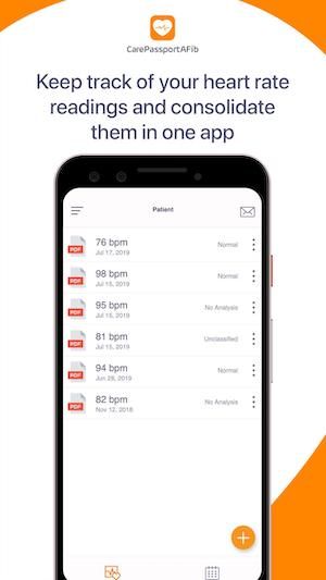
Two icons in CarePassportAFib’s tab bar. Source: APKPure
Two icons in Apple Health’s tab bar. Source: MacRumors
You should also minimise user input by utilising passive inputs and autocomplete, adjusting the keyboard depending on query type, and dynamically validating field values so users can correct mistakes right away. Implement photo captions and QR scan technology for identifying medications, insurance cards and so on.
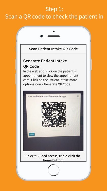
QR scanning in Kareo. Source: AppAdvice
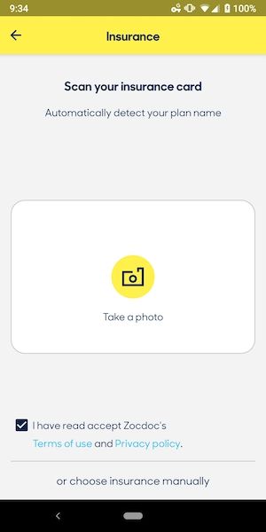
Image identification in Zocdoc. Source: ReallyGoodUX
8. Choose Proper Colours
A colour scheme is what makes the first impression on users. Strident colours and extreme combinations are a bad choice for healthcare apps. Since the point of an app is to solve a real-life problem and, ultimately, make people healthier, it should make users peaceful and confident every step of the way.
Both warm and cool tones are used in healthcare apps, as long as they don’t disturb or call for too much attention. Green and blue tones are prevalent in most medical apps. It’s also logical to add some red elements when relevant to the app’s focus, for instance, heart rate monitors or period trackers.
There can be colour customisation such as in Medisafe’s premium version where users can choose among eight colour themes.
An example of a white user interface in a healthcare application:
WebMD. Source: APKPure
An example of a blue interface:
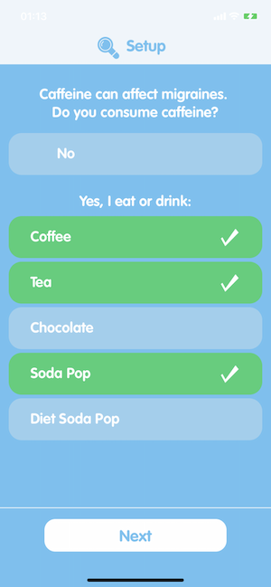
Migraine Insights
Since the choice of colours is naturally linked to the app’s focus, it’s common for sleep trackers to use darker tones:
Pillow. Source: Neybox
Bright screens may cause eye strain and drain the battery quicker which is why more applications are provide dark mode now.
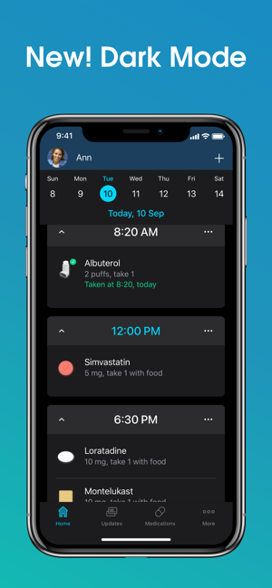
Medisafe’s dark mode. Source: Apple App Store
It’s also important to take colour blind users into consideration. There are several types of colour blindness so to make your design universal, accentuate the contrast between coloured objects with the luminance contrast or additional captions. You can provide a separate mode for colour blind users.
Look how barely distinguishable the blue text on the blue background is:
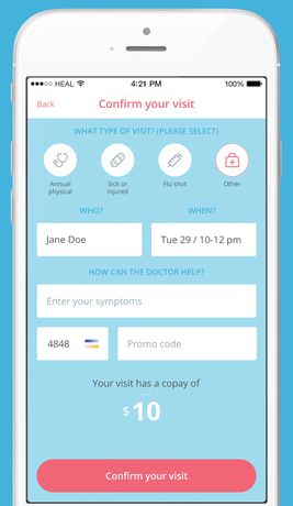
Bad choice of colours in the Heal app. Source: MobiHealthNews
Design tools like Sketch and Figma provide plugins that display your design the way colour blind people see it.
9. Make Your Design Consistent
Maintain visual and functional consistency across the app, making elements match and function similarly. Here’s the example of consistent hospital app design:
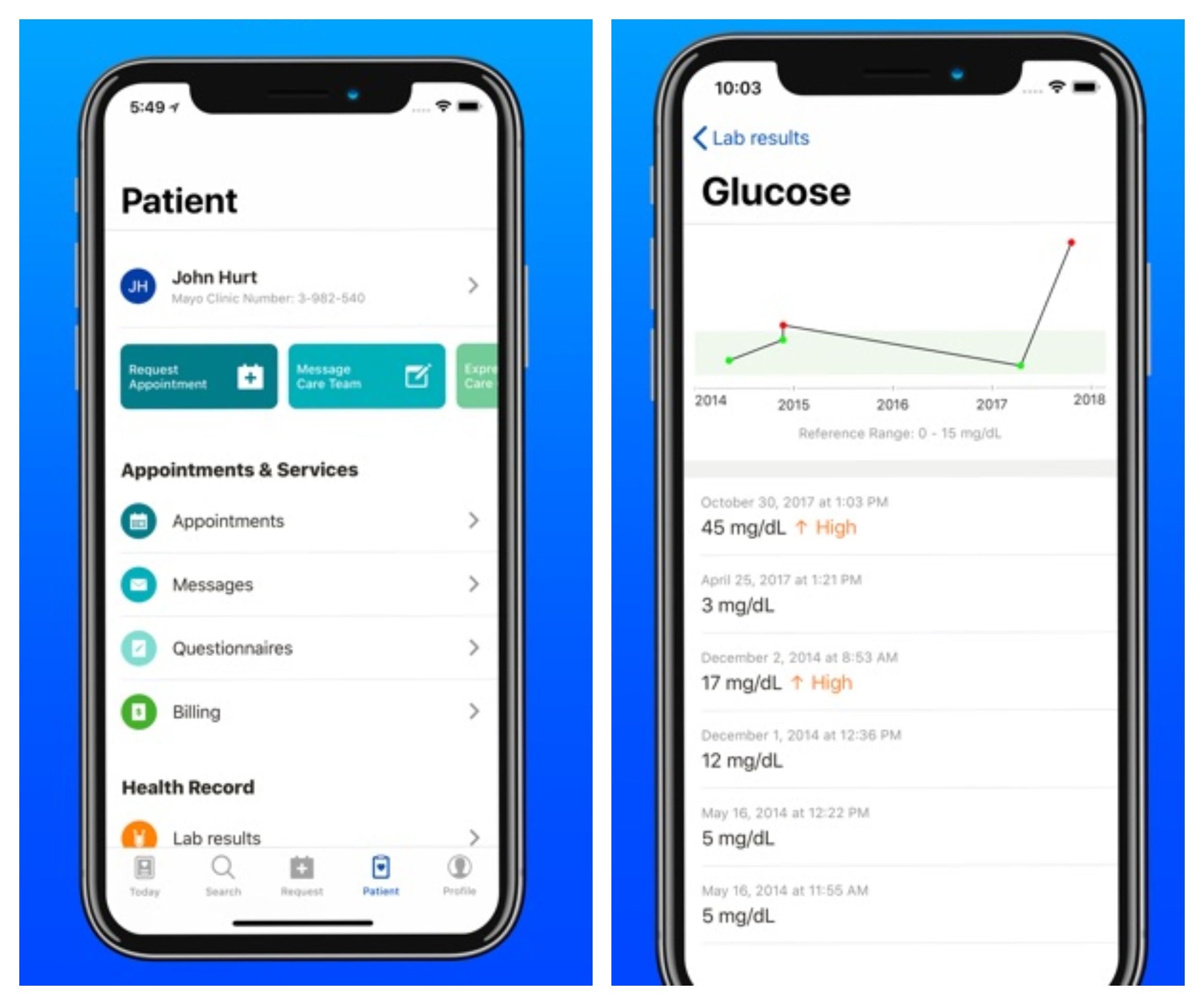
Hospital mobile app design in the Mayo Clinic app. Source: Apple App Store
10. Maintain a Positive Tone
In general, the idea behind medical apps is to enhance quality of care and make tiresome processes simpler. You need to make the general tone of your app positive and encouraging, especially if it’s a patient-facing program that requires some actions to be performed and inputted. Implement motivational messages, funny pictures, or other elements at different stages of the user’s journey through your app.
Be careful in crafting messages which give users certain instructions or review their progress. Participants of a study on user perception didn’t like it when an app gave them orders or provided negative feedback.
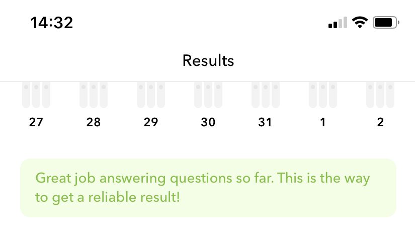
Here’s an example of encouragement during onboarding in the Sleeprate app:
Here’s how Moodpath motivates users to continue submitting their mood data:
11. Make Helpful Notifications
The tone of voice in notifications should be consistent with your app’s message in general. To design proper notifications, create a detailed messaging matrix which includes:
- Type (in-app or push notifications)
- Category (event-based, location-based, call to action)
- Priority level
- Character limits
Once you develop the messaging part, think about when and how to set them into action. For in-app alerts, you can design a dedicated notification centre. It should be easily discoverable on any screen. For example, the medical reference app Epocrates features a separate notification centre:
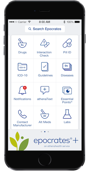
Source: Epocrates
Or, you can mark notifications depending on their source, with no single centre collecting them. The Healow app marks in-app notifications in each category:
Source: Healow
A valuable feature in pill reminder apps is notification synchronisation with family members or caregivers:
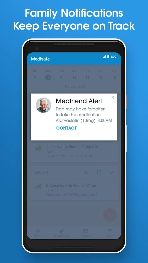
Family notifications in Medisafe. Source: Team OS
Push notifications are most effective in applications focused on reminders: doctor appointments, pill intakes, or other important health-related events.
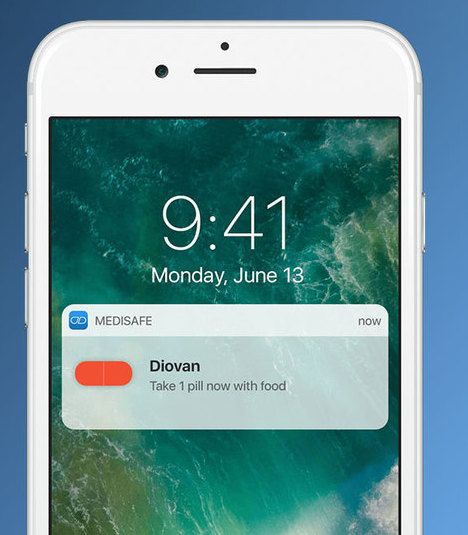
Medisafe’s push notification. Source: Medisafe
Push notifications can also serve as motivational messages:
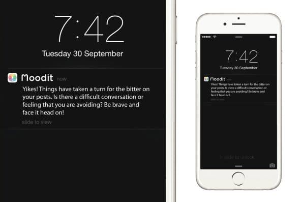
Push notification in Moodit. Source: Fast Company
Give users control over which notifications they are going to receive. Provide detailed settings with different types of alerts and explanations:
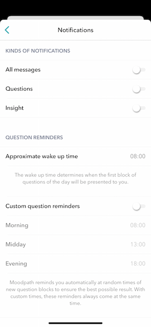
Notification settings in Moodpath
12. Android vs iOS – Mind the Platform's Conventions
If you’re making an app for both iOS and Android, it should be two separate design processes. Don’t copy the interface and navigation elements from one platform to another.
There are platform-specific design rules to consider: Human Interface Guidelines and Material Design. Note some conceptual differences between iOS and Android app design:
- Diversity of devices: There are many more Android devices that differ in the screen size and you need your app to function equally on all of them.
- Navigating between screens has different patterns: Android features a navigation bar with the back button at the bottom while iOS has a tab bar with the app’s categories and a back button on the upper left-hand corner. Both platforms support gestures but they have different purposes. A left-to-right swipe will return to a previous screen in iOS and switch tabs in Android. In any case, when adding gestures, make them natural and supplementary to visible navigation options.
- Controls and buttons have different styles.
The share button in iOS apps. Source: thepatientisin
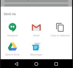
Sharing options in Android apps. Source: Medium
You might also be interested:
**[What Is the Cost of Developing a Healthcare App?](https://madappgang.com/blog/what-is-the-cost-of-developing-a-healthcare-app/)**
How to Design a Healthcare App
To develop a healthcare app, do user research first. Define the target audience and discover what matters to them in terms of functionality and experience. There are multiple app categories divided by focus: patient-doctor communication, chronic care management, EHR etc.
And varied types of user too: healthcare professionals, patients, or both. Actual user behaviour is what you need to design an app that is successful. Plan one-on-one interviews and varied usability testing sessions among your target group.
After the discovery stage, design user experience. Plan in detail how actions will be triggered and performed, how users will move from one part of the app to another, and so on.
According to the results, craft the interface. Prototype your healthcare app UI design based on the user expectations you discovered during research.
There are plenty of UI kits for health apps which can provide you with customisable screens and cut the cost of designing a healthcare app from scratch. But no template offers the ability to understand the needs of your end users and therefore solve their problems in the most convenient way.
Finally, share the design samples with developers and collaborate with them during implementation. After each functionality is completed, test the product in a relevant environment to learn what functions work and how you can improve the flow.
Do a lot of testing and learn from it: the final solution should be based on feedback from your customers.
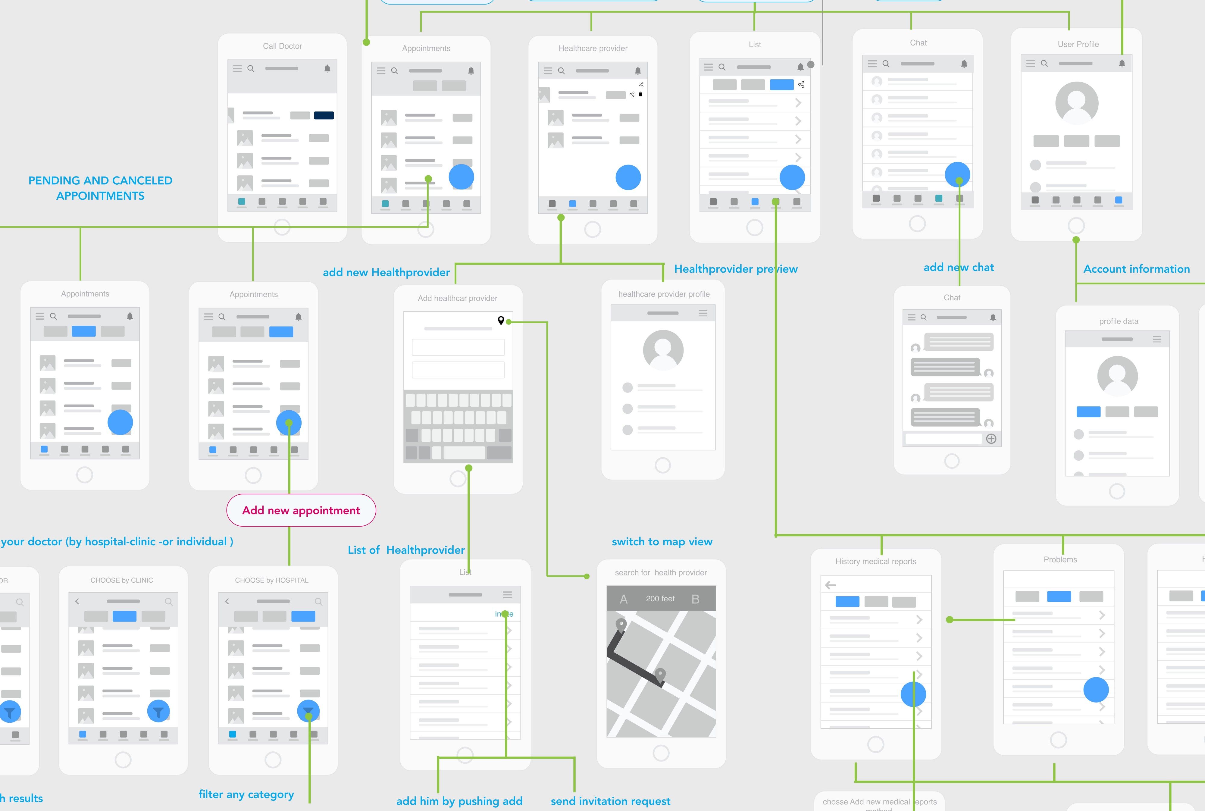
Part of the wireframing in a possible redesign of the CarePassport app. Source: Medium
Quick Overview of Medical App Design Principles
To sum it up, here’s what you need to make your healthcare app design effective:
- Make users co-design the product by communicating with them and prioritising their needs.
- Don’t implement features that don’t bring any value to your app.
- Keep the navigation simple and the interface clean so users can perform actions fast and hassle-free.
- Make all interactive elements visible and easily accessible, text readable, and colours calm.
- Use platform-specific accessibility features.
- Provide options for personalisation, let users adjust notification settings, personal tips, icons, colour themes etc.
- Stay positive in your message.
If you’re looking for developers with expertise in health and fitness app development, reach out to us and we’ll be happy to discuss your app idea.
13 February 2020

